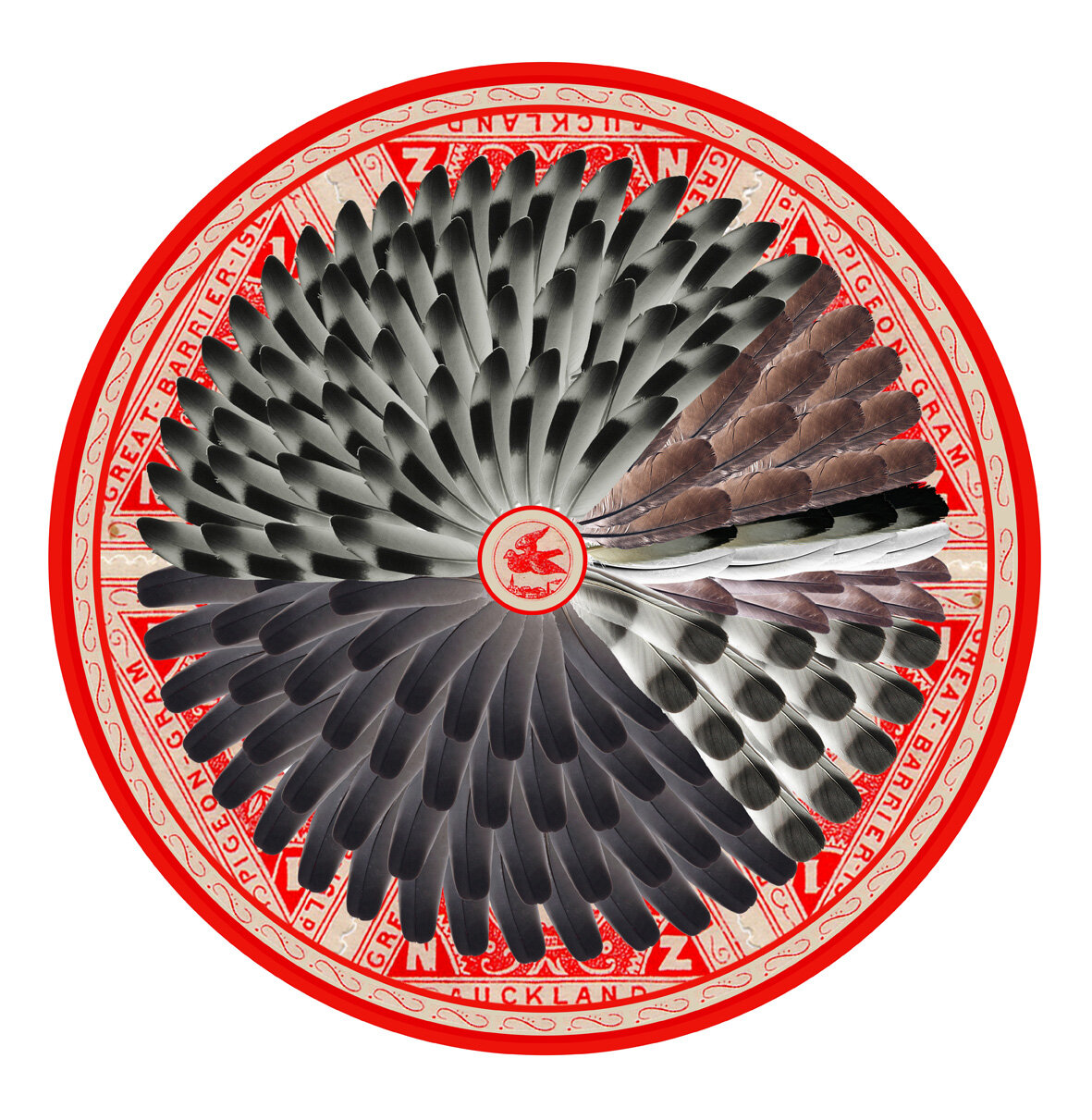
Pigeon Feather Pie Chart
In collaboration with Cornell Laboratory of Ornithology, 2012
An illustration to visualise data using a pie chart of pigeon feathers, to demonstrate the average colour of pigeons observed over a year in Leicester.
The artwork was inspired by a Citizen Science project at Cornell Laboratory of Ornithology, to find out why pigeons exist in a variety of colours. Between 2010 - 2011 I observed and gathered information on pigeon colours in Leicester. The bright red imagery was taken from an early stamp created for the Pigeon-Gram service on the Great Barrier Island (New Zealand), produced when the Pigeon Post service began between the island and Auckland in 1897.

Pigeon Clock Graph
In collaboration with Cornell Laboratory of Ornithology, 2011
An illustration to represent the average number of pigeons monitored over a year in Leicester.
The artwork was inspired by a Citizen Science project at Cornell Laboratory of Ornithology, to find out why pigeons exist in a variety of colours. Between 2010 - 2011 I observed and gathered information on pigeon colours in Leicester.
The image is layered using toulet clock faces from an automatic pigeon clock, used for pigeon racing. Symbols of birds and dots are used to represent the number of pigeons seen each day, with a full bird representing 10 pigeons and a dot representing an individual bird.